Lighting plays a critical role in commercial spaces. Beyond mere functionality, lighting contributes to the overall aesthetics, atmosphere, and user experience.
Among the factors influencing commercial lighting design, color temperature is a vital element that can dramatically impact the ambiance, utility, and perception of a space. This article will explore the importance of color temperature, its various applications, and how to select the appropriate color temperature for different commercial settings.
The History of Color Temperature in Lighting

The history of color temperature began with the study of blackbody radiation in the late 19th century, leading to the adoption of the Kelvin scale for quantifying the color of light sources.
While original illumination sources such as candlelight and gas light provided a limited range of temperatures, subsequent developments, such as the introduction of fluorescent and LED lights, expanded the available range of color temperatures in commercial and residential lighting design. As a result, today's lighting designers have an enormous range of colors that they can use to effectively tailor lighting solutions for commercial and residential environments.

Understanding Color Temperature
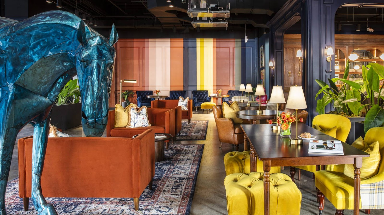
Color temperature is measured in Kelvins (K) on a scale of 1000K to 10,000K for the purposes of lighting specification and refers to the warmth or coolness of a light source as shown in the image above.
Lower color temperatures (2,700K - 3,000K) are characterized by a warm, yellowish light, reminiscent of incandescent bulbs or candlelight.
Intermediate color temperatures (3,500K - 4,500K) fall within the range of neutral white light.
Higher color temperatures (5,000K - 6,500K) emit a cool, bluish-white light, similar to daylight.

Importance of Color Temperature in Commercial Lighting Design
Aesthetics and atmosphere: The choice of color temperature can have a significant impact on the overall look and feel of a space, creating a warm and inviting atmosphere or a cool, modern vibe.
User comfort and well-being: Selecting the appropriate color temperature can contribute to user comfort, productivity, and overall well-being. For example, cooler color temperatures are generally considered more energizing and can help improve focus, while warmer color temperatures create a cozy, relaxing environment.
Color rendering and product display: In retail and display settings, choosing the right color temperature is essential for accurately showcasing products and enhancing their visual appeal. Different products will have different rendering and temperature requirements, for example, clothing can be displayed in warmer temperatures while diamonds and jewelry benefit from pure white light.
Selecting the Right Color Temperature for Various Commercial Spaces

Retail environments
In retail settings, the choice of color temperature will largely depend on the type of products being displayed and the desired shopping experience. Warmer color temperatures can enhance the appearance of wood, fabrics, and other warm-toned materials, while cooler color temperatures may be more suitable for displaying electronics, jewelry, or cosmetics.
Emphasize products: Consider cooler color temperatures (4,000K - 5,000K) to highlight products and make colors appear more vibrant.
Create ambiance: Warmer color temperatures (2,700K - 3,000K) can evoke a cozy, inviting atmosphere, especially in boutique settings or when showcasing luxury items.

Restaurants and hospitality venues
Restaurants, hotels, and other hospitality spaces typically benefit from warmer color temperatures (2,700K to 3,000K) to create a cozy, inviting atmosphere. However, cooler color temperatures may be appropriate in certain areas, such as kitchens or workspaces, where higher levels of alertness are required.
Fine dining: Opt for warmer color temperatures (2,700K - 3,000K) to create an intimate, sophisticated atmosphere.
Casual eateries: Use a neutral white light (3,500K - 4,500K) for a clean, welcoming environment.
Cafes and bars: experiment with various color temperatures to craft unique spaces, such as warmer tones for seating areas and cooler tones for food displays.

Office spaces
In office environments, a neutral to cool color temperature (3,500K to 5,000K) is typically recommended, as it can help boost alertness and productivity. However, incorporating warmer color temperatures in break rooms or lounge areas can create a more relaxing atmosphere.
General work areas: Aim for neutral to cool white light (4,000K - 5,000K) to promote alertness and productivity.
Meeting and conference rooms: Choose a neutral white light (3,500K - 4,500K) to strike a balance between formality and comfort.
Break rooms and lounges: Use warmer color temperatures (2,700K - 3,000K) to create a relaxing atmosphere for employees.

Healthcare facilities
In healthcare environments, a balance between warm and cool color temperatures is often recommended, with warmer tones in patient rooms and waiting areas for comfort and relaxation, and cooler tones in examination rooms and surgical suites for improved focus and visibility.
Patient rooms: Select warmer color temperatures (2,700K - 3,000K) for a comforting, calming environment.
Examination and treatment areas: Opt for cooler color temperatures (5,000K - 6,500K) to promote clarity and precision.

Art galleries and museums
Highlight artwork: Choose color temperatures that best complement the specific artwork or exhibition, taking into consideration factors like color rendition and the overall atmosphere. A high CRI and pure white light are typically used for canvas and wall art, while art fixture installations can often be highlighted by warmer colors.
Balancing Aesthetics and Functionality
When selecting color temperature for a commercial space, consider both aesthetic and functional aspects. Keep in mind the intended purpose of the space and how the chosen color temperature may impact the user experience. Experimenting with layers of light and utilizing lighting control systems can also offer the flexibility to adjust color temperature based on specific needs or events.
Best Practices for Implementing Color Temperature in Commercial Lighting Design
Assess the space and user needs: Begin by evaluating the functional requirements, user preferences, and desired atmosphere of the space to determine the most appropriate color temperature.
Consider color rendering: When selecting light sources, pay attention to the Color Rendering Index (CRI), which indicates how accurately a light source reveals the true colors of objects. A higher CRI (above 80) is generally preferred for most commercial applications.
Combine color temperatures: In some cases, it may be beneficial to use a combination of color temperatures to create depth, interest, and flexibility within a space.
Plan for adjustability: Incorporate lighting controls, such as dimmers and tunable white systems, to enable users to adjust color temperature and light levels based on their specific needs and preferences.
Coordinate with other design elements: Ensure that your chosen color temperature complements the colors, materials, and finishes used throughout the space to create a cohesive and harmonious design.
Test and refine: Once your color temperature selections are in place, evaluate their effectiveness and make any necessary adjustments to achieve the desired result. This may involve fine-tuning lighting controls or experimenting with different light sources.
Conclusion
Mastering color temperature selection is essential for design professionals working in commercial lighting. Color temperature is a critical component of good commercial design, influencing aesthetics, mood, and user comfort. By understanding the principles of color temperature and applying them thoughtfully and strategically, design professionals can create commercial spaces that cater to the diverse needs of users while enhancing the overall visual appeal and functionality of the environment. With careful planning and attention to detail, designers can harness the power of color temperature to elevate their commercial lighting designs to new heights.
Learn more about color temperature with these resources:
Energy,gov Understanding all the variations in color-tunable products can be challenging, so it may be helpful to consider each product type in terms of its most common applications, control options, and potential issues or complications.
SORAA.com Color temperature can drastically alter one’s perception, mood and overall experience in a space. As lighting designers, we have the option to control our viewers’ emotions using simple shifts in color temperatures. No matter the application, color temperature can be used to accentuate different elements and blend an array of color temperature to best suit features in a space.
Wiley.com : Lighting Design Basics is the essential guide to this basic, but difficult-to-master aspect of interior design. Offering fundamental concepts and prescriptive techniques in a highly visual format, this book provides clear, practical guidance on utilizing the latest in lighting techniques and technology to showcase a space without sacrificing utility.